Adopi
Adopi is a consulting firm specializing in helping companies optimize their processes and improve their overall performance. Backed by a team of experts, Adopi focuses on innovation and sustainable development to offer its customers tailor-made strategic solutions.
Services :
Key steps :
Benchmarking, Design, Prototyping, Refining
Project objective
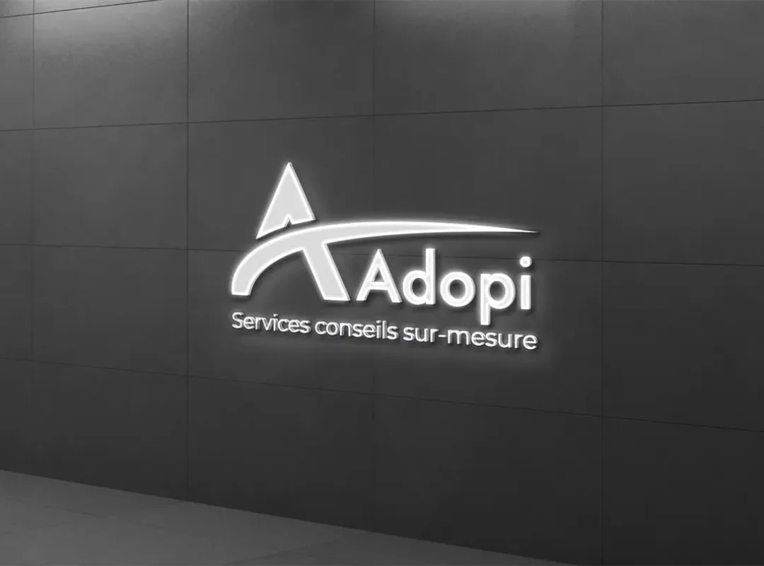
The aim of this project was to create a modern and elegant logo for the consulting firm Adopi. They wanted to highlight the letter “A” by adding a movement that indicates forward motion, growth and evolution for the customers who will do business with Adopi.
Approach and Implementation
1. Initial meeting and understanding needs :
We started with a detailed meeting with the Adopi team to understand their vision, values and objectives. This discussion helped define expectations and lay the foundations for the creation of the logo. We particularly noted the importance of symbolizing progression and evolution in design.
2. Market analysis and benchmarking
Next, we carried out an in-depth market analysis to understand current logo trends in the consulting sector. We also studied the logos of Adopi’s competitors to identify the distinctive elements that could set Adopi apart.
3. Brainstorming and preliminary sketches
Based on the information gathered, our design team organized several brainstorming sessions to explore various creative ideas. We sketched out several preliminary concepts, highlighting the letter “A” and incorporating elements of movement and growth.
4. Prototype development
Based on the feedback we received, we developed several digital prototypes of the logo. Each of these prototypes incorporated subtle variations in color, typography and design elements to offer Adopi a range of options.
5. Revision and Refining
After presenting the prototypes, we worked closely with Adopi to refine the final design. This stage involved several rounds of revisions to fine-tune every detail and ensure that the logo perfectly reflected the company’s identity.
6. Completion and delivery
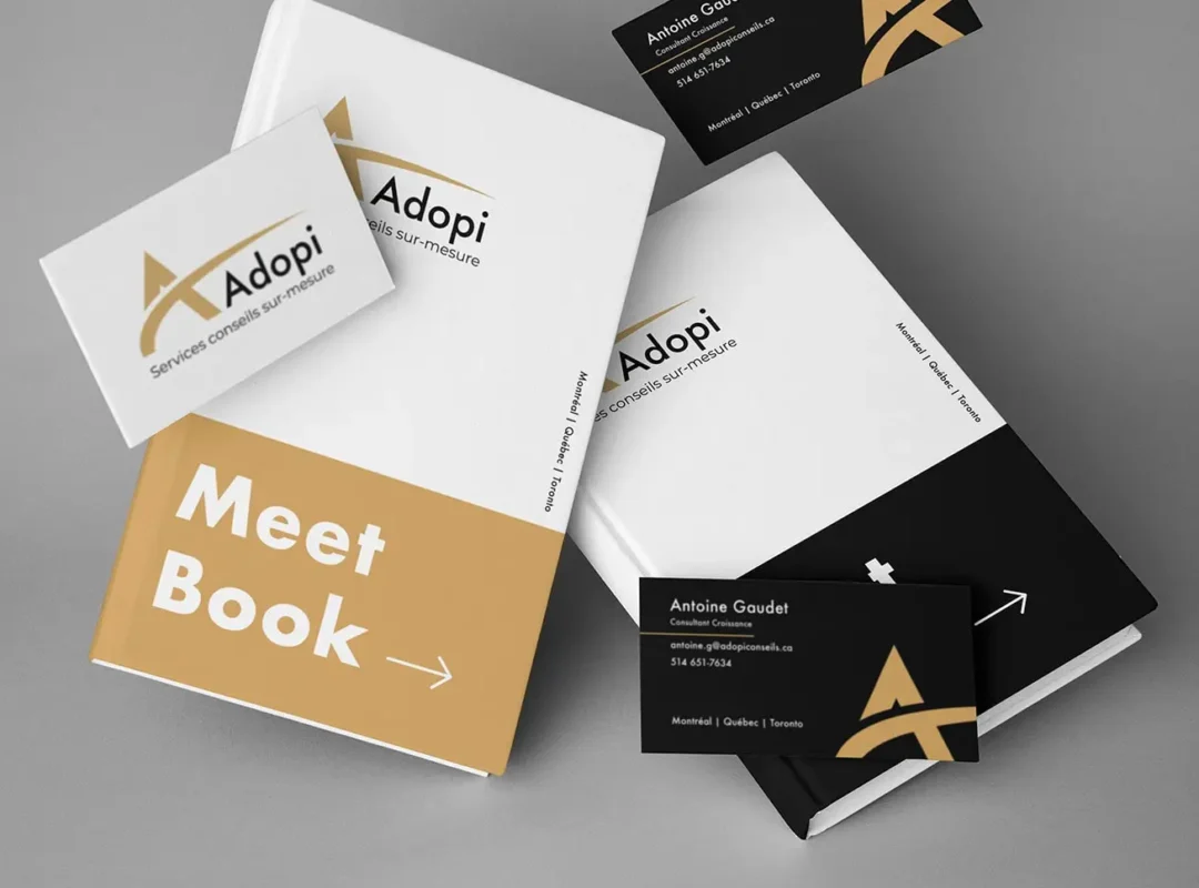
Once the final design was approved, we created the final versions of the logo in different formats (JPEG, PNG, SVG, EPS) for flexible use on various media. We also provided a logo user guide to ensure visual consistency in all brand communications.
Final result
The final logo for Adopi is a powerful symbol of modernity and elegance. The letter “A” is stylized to represent fluid, upward movement, symbolizing growth and evolution. Clean lines and subtle color choices reinforce the impression of professionalism and dynamism.
Project manager
Antoine G.
"Working with the WebPlify team has been a great experience. Their creativity and attention to detail exceeded our expectations. The new logo perfectly reflects our vision and mission. We can't wait to unveil it to our customers and partners."


