In the digital world, user experience (UX) is essential to establishing a relationship of trust with visitors. Yet some design techniques, known as dark patterns, use subtle strategies to push users to make decisions they wouldn’t have made spontaneously. While these tactics can sometimes produce quick results, they often damage a company’s reputation in the long term.
In this article, we explore what dark patterns are, give concrete examples and explain why avoiding them is crucial to maintaining a relationship of trust with your users.
Table of contents
Table of contents
ToggleWhat are Dark Patterns?
The term dark patterns refers to intentionally deceptive design techniques that manipulate users into performing actions against their will. These techniques are often invisible at first glance, as they are hidden in navigation options, payment pages or subscription forms.
Dark patterns can include hidden fees, complicated options to cancel or guilt-inducing messages urging users to accept an offer. While these methods may temporarily boost conversion rates, they end up frustrating users, damaging brand reputation and reducing loyalty.
The main types of Dark Patterns
Here are the most common types of dark patterns, with concrete examples to illustrate how they work:
1. Hidden costs
Hidden costs are added at the final stages of a purchase, often just before payment, surprising the user with extra charges such as processing fees, shipping costs, or even additional service options.
Example: On some travel booking sites, the price seems attractive at first, but at the final payment stage, insurance or service charges are automatically added. The user is faced with a much higher amount than expected.
Why it’s a problem: These last-minute additions create a feeling of betrayal in the user, who may feel manipulated. This can lead customers to abandon their shopping baskets or, worse still, never return to the site.
2. Confirmation of shame
The principle of shame confirmation relies on guilt-inducing messages that urge the user to accept an offer to avoid feeling bad. For example, if the user wishes to decline an offer, the button for declining the offer could display a sentence like “No, I’d rather miss this once-in-a-lifetime opportunity”.
Example: You’ve probably already seen a pop-up window offering you a discount with two options: “Yes, I want to save money” or “No, I don’t like saving money”. This wording seeks to influence the user by making them feel guilty.
Here is a more visual example of a design using the “Confirmation of shame” principle: if the user does not wish to subscribe, he must click on “NO THANKS, I PREFER TO PAY THE FULL PRICE”.

Why it’s problematic: This technique manipulates users by exploiting their need for validation. In the long term, this feeling of pressure harms the company’s image, which risks being perceived as aggressive and intrusive.
3. Cockroach traps
A roach trap is a situation where it’s very easy to sign up or subscribe to a service, but extremely difficult to unsubscribe from it. Users may be faced with multiple steps, complex forms or confirmation pages to cancel their subscription.
Example: Some subscriptions to streaming services or software require a phone call to cancel, despite simplified online registration. Others require you to contact customer support, making the cancellation process deliberately complicated.
Why it’s problematic: This type of dark pattern erodes trust and annoys users, who feel trapped in a service. Once freed from these subscriptions, they are unlikely to return or recommend the service.
4. Disguised advertising
Disguised ads take the form of content or features, so that the user clicks without realizing that they are interacting with an ad.
Example: Some sites use images or buttons that look like features or parts of the main content, but redirect to advertising pages or sponsored products.

Why this is problematic: This dark pattern reduces transparency and the user’s sense of control, as they may find themselves redirected to unwanted pages. This undermines the site’s credibility and can lead to a loss of trust.
5. Manipulating emotions through urgency or scarcity
Creating a sense of scarcity or urgency is a very common, and sometimes legitimate, marketing technique. But some sites misuse it, displaying messages like “Only 1 room left!” or “Offer valid for 10 minutes!” when the offer remains active for a long time afterwards.
Example: On some e-commerce sites, you may see a message indicating that the product is almost sold out or that the sale is ending soon, even if the offer is still valid hours later.
Why it’s problematic: By exaggerating urgency, sites manipulate users into believing they need to make an immediate decision, which can lead to impulse purchases and regret.
6. The barrier to price comparisons
Some sites complicate price comparisons by presenting options in an ambiguous way or by concealing certain information. This makes it difficult for the user to compare offers and make an informed decision.
Example: When taking out a subscription, some companies do not clearly display the prices of the various options. Customers sometimes have to click several times or search through drop-down menus to find all the prices.
Why this is problematic: Preventing users from comparing prices limits their ability to make a rational choice. This practice creates confusion and can lead to frustration.
7. Hidden changes in parameters
Sometimes additional options, such as newsletter subscription, are automatically selected without the user’s knowledge. This can happen when registering or finalizing an order.
Example: When subscribing to a service, a box for “Receive promotional offers” is automatically ticked, and the user unintentionally subscribes to newsletters.
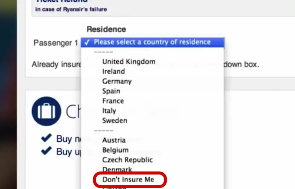
The Ryan Air example is particularly revealing: to refuse insurance, the user is obliged to select “don’t insure me” in the country drop-down list, where he or she is normally supposed to indicate his or her country of origin.

Why this is problematic: Forcing users to disable default options is a subtle manipulation that can irritate them, especially if they only discover the unwanted subscription after the fact.
8. Misdirection (Diversion of attention)
Attention detour consists in making important information or buttons less visible, emphasizing the company’s desired options to guide the user’s choice.
Examples:
- When a site highlights the “Accept cookies” button in a large, bright color, while the “Reject cookies” button is small and in gray text.
- A pop-up window prompting the purchase of an additional warranty option with a large, colorful button, while the opt-out option is discreet and inconspicuous.
9. Friend Spam
Friend Spam uses a user’s network of contacts to send messages without their explicit consent, exploiting trust in friendly relationships.
Examples:
- A social networking application that asks users to access their contacts to invite friends, but then automatically sends invitations without notifying the user.
- A gaming application that encourages sharing results with friends to earn points, sending messages automatically to all the user’s contacts.
10. Privacy Zuckering
Privacy Zuckering involves tricking users into providing more personal information than they want. Privacy settings are often configured to expose more data, and privacy options are difficult to find or activate.
Examples:
- A social network that asks for personal information without the user understanding the extent of what they are sharing, for example by hiding advanced privacy settings in sub-menus.
- A registration form with boxes already ticked, enabling companies to share user data with commercial partners.
11. Forced Continuity
Forced continuity involves starting with a free trial period or promotional offer, then billing the user without warning once the period is over. Termination procedures are often difficult and unintuitive.
Examples:
- A streaming site offers a free 30-day trial, but does not notify the user when the trial ends, billing him automatically. To unsubscribe, the user must contact customer service.
- An online subscription that requires a credit card for the free trial and starts billing the user without notification before the end of the trial period.
Why you should avoid Dark Patterns
Dark patterns may yield quick results in terms of clicks or conversions, but they pose many problems for businesses:
- Loss of user confidence: Modern users are increasingly sensitive to deceptive practices. Once they discover manipulation, they lose confidence in the brand and are unlikely to return.
- Bad reputation: Negative reviews spread rapidly online. Dark patterns can generate unfavorable comments and reviews that damage a company’s reputation.
- Legal consequences: In some regions, such as the European Union, dark patterns practices can lead to legal sanctions. Transparency and consumer protection laws are being strengthened to protect users.
- Impact on SEO and Ranking: Google takesuser experience into accountwhen ranking. High bounce rates or prematurely closed pages can signal poor UX and harm your site’s ranking.
- Compromised Customer Loyalty: If users feel they have been cheated, they are less likely to return and become loyal customers, reducing the long-term value of the customer relationship.
How to replace Dark Patterns with Good Practices
- Transparency: Be clear about the fees, options and subscriptions on offer. Transparency builds user confidence.
- Optimal User Experience: Simplify options such as subscription cancellations, and design an intuitive and pleasant navigation process.
- Use Psychology Ethically: Create a sense of urgency or scarcity, but do it honestly. Don’t force users to make hasty decisions.
- Offer Customer Support: Make sure users can get answers easily. Effective customer service improves satisfaction and reduces frustration.
Conclusion
Dark patterns may seem effective for quick results, but the risks far outweigh the long-term benefits. Opting for transparent, user-centered design practices is the best approach to building trust with your audience, retaining customers and strengthening your company’s reputation.
By avoiding dark patterns, you create an honest, respectful digital environment that attracts users ethically and generates sustainable growth.


